
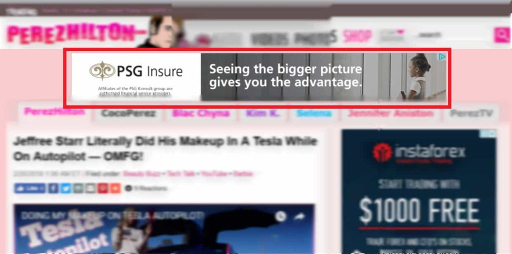
As a publisher, you often do your regular checks on your site. On desktop, all ads seem to be loading correctly. Mobile seems fine, but then you scroll down and notice an oversized 300×250. A 414×345 is displayed on a medium rectangle ad slot instead of the 300×250 you initially wanted even after you’ve defined the size inventory for your mobile unit.
There have been several reports in forums and boards about Ad Exchange rendering the wrong ad size in mobile views. This has been attributed to the Ad Expansion feature on Google Ad Manager. Ad slots are expanded to the maximum allowed space for a mobile device to give it a more organic fit in the content. At the moment, it is only available to backfill display and out-stream video ad slots on the mobile web. Not all ad slots are eligible for expansion, though.
To uphold the ad’s aspect ratio, it may expand to the width of the device, while the height may be equal but only when appropriate. There are instances that it will not always fill to the device’s size in width and height. According to Google Support, these instances are:
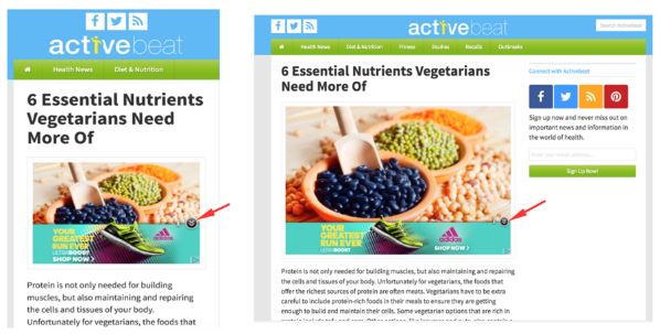
You will see something similar to these:

The left image is the ad displaying your set inventory size, for example, 300×250. With the Ad expansion feature, the ad will appear like the image on the right, a 414×345.
The expansion will attempt to fit the device’s width, as long as the content is not being overlaid. According to Google Support:
This feature is enabled for all users, but being able to control (enable or disable) it is only available for paid accounts on Google Ad Manager 360. For non-paying users, Ad Contraction is the other feature you can control, which is the opposite of Ad Expansion. This allows smaller creatives to deliver other than the specified inventory size/s.
If you are using Google Ad Manager 360, you can disable this feature at the network level by:
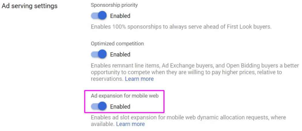
For Unified Pricing Rules this is also applicable. However, if you have set-up size-specific rules, it will only apply to requested sizes. This means that if the ad comes back with an expanded size, your UPR will not apply.
The Ad Expansion feature enhances user experience by allowing ads to fit more organically within the content. However, this feature can lead to discrepancies in expected ad sizes, which may have significant implications for revenue generation.
When ads expand beyond their designated sizes, it can confuse both publishers and advertisers regarding the actual dimensions being served. For instance, a 300×250 ad slot displaying a 414×345 ad may not align with the expectations set during the campaign planning phase. This misalignment can lead to several issues:
Engagement metrics can vary significantly between expanded ads and standard-sized ads. Expanded ads may initially seem beneficial as they occupy more screen space, potentially increasing visibility. However, the actual performance can differ:
The implications of ad expansion on revenue are multifaceted:
To ensure optimal display and user engagement, you need to implement responsive ad units that automatically adjust based on the device’s viewport. Here are some examples of effective, responsive design techniques for ad units:

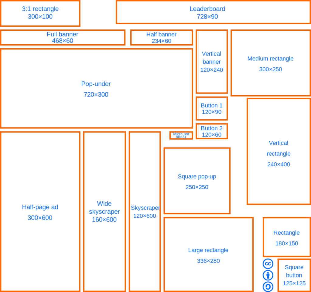
Fluid ad units adapt their size to the available space on the page, ensuring they fit seamlessly within the content. These ads can expand or contract horizontally while maintaining their aspect ratio, allowing them to work across various screen sizes and orientations. Example: A 300×250 medium rectangle ad that expands to 728×90 on larger screens and adjusts to 320×100 on mobile devices.
Viewport-based sizing uses CSS media queries to adjust the ad unit’s dimensions based on the device’s viewport width. This technique allows for precise control over the ad’s size, ensuring it occupies the optimal space on the screen without disrupting the user experience. Example: A 728×90 leaderboard ad that switches to a 300×600 half-page ad on larger screens and a 320×50 mobile banner on smaller screens.
Responsive image ads use a combination of HTML and CSS to automatically select the most appropriate image size for the available space. This technique ensures that high-quality images are displayed without compromising load times or user experience. Example: A 300×250 medium rectangle ad that displays a 1200×628 image on larger screens and a 640×360 image on mobile devices.
Flexible grid layouts use CSS to create a grid-based system that adapts to different screen sizes. This technique allows for the rearrangement and resizing of ad units based on the available space, ensuring a consistent and visually appealing layout across various devices. Example: A 3×3 grid of 300×250 medium rectangle ads that collapses into a single column of 320×100 ads on mobile devices.
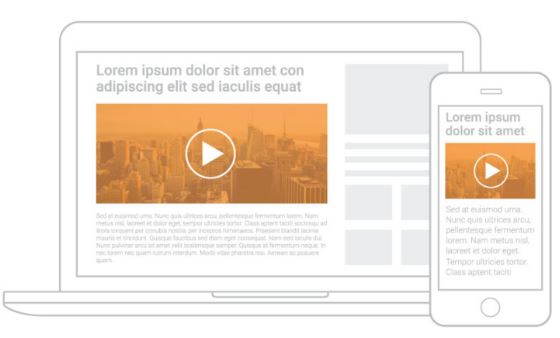
Adaptive content techniques use JavaScript to detect the user’s device and serve content optimized for that specific device. This includes adjusting the ad unit’s size, format, and even the type of ad creative displayed to ensure the best possible user experience. Example: A 728×90 leaderboard ad that displays a video ad on desktop devices and a static image ad on mobile devices.
By defining ad slots that accept multiple sizes to accommodate various creatives, publishers can improve fill rates and revenue. This flexibility not only enhances the overall user experience but also allows for better alignment with advertisers’ goals, leading to more successful campaigns. Embracing responsive ad units and implementing best practices in ad design will empower publishers to navigate the complexities of programmatic advertising effectively, ultimately driving greater success in their monetization efforts.
Still not sure how to handle ads not rendering the correct size? How about sorting out any other ad optimization issues that are causing you to lose out on revenue? Let MonetizeMore help! Our ad ops teams can help solve any ad optimization issue and optimize your ad inventory for maximum revenue. Sign up to MonetizeMore now!

With over ten years at the forefront of programmatic advertising, Aleesha Jacob is a renowned Ad-Tech expert, blending innovative strategies with cutting-edge technology. Her insights have reshaped programmatic advertising, leading to groundbreaking campaigns and 10X ROI increases for publishers and global brands. She believes in setting new standards in dynamic ad targeting and optimization.
10X your ad revenue with our award-winning solutions.