Google’s long-awaited shift to mobile-first indexing is now a reality. As of July 5th, 2024, if your site is inaccessible on mobile devices, Google will not index it. This significant change underscores the importance of ensuring your website is crawlable and user-friendly on mobile devices.

Use these tools to fix any issues that might hinder your site’s mobile performance and usability before July 5th:
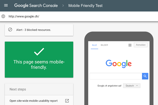
This is the most straightforward tool to use. Simply enter your site’s URL, and Google will assess its mobile-friendliness and provide a report.

This tool lets you test your website across a wide range of real mobile devices, browsers, and operating systems. You can see exactly how your site looks and functions on various mobile devices.

This tool offers a comprehensive analysis of your site’s mobile readiness. It provides scores for various aspects of mobile optimization, along with suggestions for improvement.

This tool provides a detailed analysis of your site’s mobile performance and usability. It offers both free and paid versions, with the paid version providing more in-depth insights.

While primarily a performance testing tool, GTmetrix also provides insights into the mobile-friendliness of your site. It analyzes factors like mobile responsiveness and resource optimization.

This simple tool lets you preview your website on different screen sizes to ensure its responsiveness. It’s a quick way to check if your design adapts well to various mobile devices.

To test if your website is fully responsive, you can follow these steps:
By following these best practices, you can ensure that your site is mobile-friendly, user-friendly, and optimized for mobile-first indexing, which is now the standard practice for search engines:
Ensure that the mobile version of your site aligns with the desktop version for optimal indexing and user satisfaction. Prioritize a unified experience that adapts to different devices, enhancing accessibility and appeal to a diverse audience.
Craft your website with mobile-friendly precision by using shorter paragraphs, concise sentences, and legible fonts that enhance readability. Avoid user experience pitfalls by ensuring that your visitors can seamlessly navigate and engage with your content on mobile devices.
Ensure that structured data remains consistent across different versions of your site to guide search engines through the intricate details of your web content. This enhances the accuracy of search engine indexing and contributes to a more cohesive online presence.
Use responsive design to ensure that your site adapts to different screen sizes. Optimize for page speed on mobile devices.
Test and monitor your site for errors and optimize for mobile SERPs. Don’t forget to avoid intrusive interstitials.
Focus on aspects of the mobile user experience, such as page load time, mobile responsive design, and mobile usability. Sites with a seamless mobile experience are more likely to rank higher in search results.
Get your free Mobile Ad Optimization Ebook here!

The shift to mobile-first indexing is a significant change that requires publishers to prioritize mobile accessibility. By ensuring your site is crawlable and user-friendly on mobile devices, you can avoid indexing issues and maintain a strong online presence. Don’t wait until it’s too late; take action now to ensure your site is mobile-friendly and ready for the July 5th deadline.
Ready to 10X your mobile ad revenue? Get started here!

With over ten years at the forefront of programmatic advertising, Aleesha Jacob is a renowned Ad-Tech expert, blending innovative strategies with cutting-edge technology. Her insights have reshaped programmatic advertising, leading to groundbreaking campaigns and 10X ROI increases for publishers and global brands. She believes in setting new standards in dynamic ad targeting and optimization.
10X your ad revenue with our award-winning solutions.