This post was most recently updated on September 15th, 2021
Welcome to lesson #2 of the FREE Mobile Ad Optimization Course. We sure hope you’re on momentum to get your mobile site and ads ready for income generation.
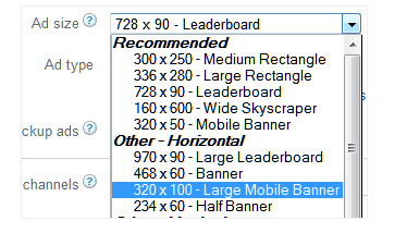
Today, we will discuss Google’s very popular large mobile banner: the 320 x 100 ad unit. This ad unit appears automatically in your list of sizes if you manage your inventory via DFP.
Find out more about ad units here: https://www.monetizemore.com/blog/what-is-ad-unit

320×100 ad unit typically yields higher CTRs versus the usual 320×50. One of the reasons for this is its great text fill (large mobile banner), producing more click-throughs:

Photo credit: onlinelearning.diabetessa.com.au
When you use the 320 x 100 ad unit, it can compete against the 320 x 50 ad, enabling you to increase your fill-rate because of the added pressure. This leads to higher eCPMs, thus more ad revenue for you.
If you have a responsive site, or if you use Google’s responsive ad units, you don’t need to worry about the 320 x 100 not fitting into the mobile screen. With Google’s responsive units, it will automatically shrink to the ideal mobile screen size and thus will lead to a better user experience.
Related Read: How to Make Responsive DFP Ad Units
Research shows that the most valuable ad position is right above the fold.
- Sign up to DFP and implement your 320×100 ad unit above the fold to let it compete with the 320×50.
- Make sure there is 150 pixel distance between your ads and hyperlinked elements to avoid accidental clicks
That concludes our lesson for today. Don’t forget to come back next Thursday for another edition of the FREE Mobile Ad Optimization course. Next week, we will tackle the 320×250 mobile ad unit and its most optimal placement. Until next time!
See Lesson 1: Go Mobile Responsive!
Sign up for a Professional account at MonetizeMore today to get expert guidance on how to earn more from different mobile ad formats.

Kean Graham is the CEO and founder of MonetizeMore & a pioneer in the Adtech Industry. He is the resident expert in Ad Optimization, covering areas like Adsense Optimization,GAM Management, and third-party ad network partnerships. Kean believes in the supremacy of direct publisher deals and holistic optimization as keys to effective and consistent ad revenue increases.
10X your ad revenue with our award-winning solutions.