This post was most recently updated on August 15th, 2019
If you have a site, your first priority is creating high-quality content to attract users. Now, if you have been successful in that area, monetizing your website should be easier. If you have built a site for the desktop device, you might as well consider going for a responsive design that makes it compatible for all other platforms (See Best Ad Strategies for Mobile and Tablet). But for now, let’s focus on optimizing your ads for the desktop. Here are some top desktop ad optimization strategies we highly recommend:
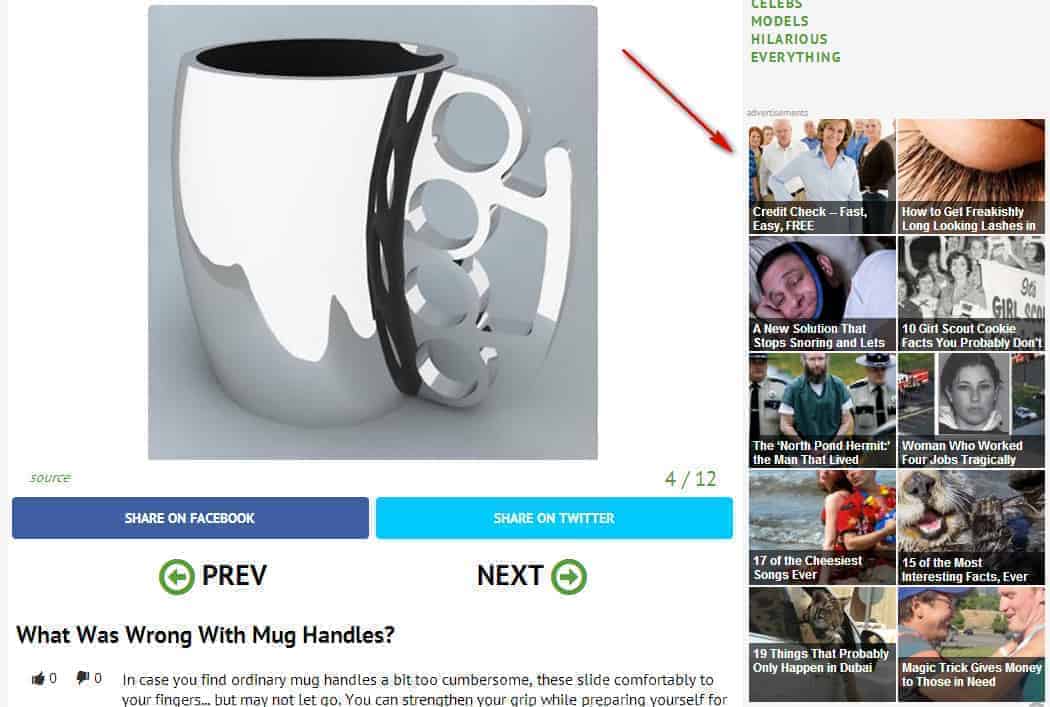
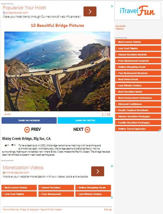
Most often than not, users tend to close or click ‘next’ after reading the content in a page and won’t even bother scrolling further down the page to see what’s in there. How about adding an interesting bottom unit and/or a right rail unit? You might want to try Outbrain, Taboola, AdBlade, Content.ad. They serve widgets that can offer an option to always display links to your internal content before links to outside content, thus further increase page views as users would tend to engage in other content you have within the site.
You might want to set them up competing against each other to increase revenues but each ad network would have its own unique optimization strategies (e.g. need to be implemented directly on-site with no competition) — the ad representative will straightforwardly inform you about it.
Here’s an example:

Google recommends this strategy as well. Here are the three options you could choose from:
Test and see which ad style performs the best and stick to it. Here’s an example of blending:

The sizes we’ve proven to be the most effective on the desktop are the 336×280 large rectangle, the 300×250 medium rectangle, the 728×90 leaderboard, and the 160×600 wide skyscraper. Don’t forget that ad placement will do the trick. Above the Fold placements tend to perform better than Below the Fold — depending on the site design. Testing is key.
Related Read: Banner Layout Cheat Sheet: Top Banner Placements that Work! Let us help you optimize and monetize your ads on multi-platform devices. MonetizeMore is an expert in website monetization for mobile, tablet, and desktop sites.
Contact us here for a FREE consultation. You may also sign-up for FREE to Google Ad Exchange (the best version of Adsense).
Related Reads:

Kean Graham is the CEO and founder of MonetizeMore & a pioneer in the Adtech Industry. He is the resident expert in Ad Optimization, covering areas like Adsense Optimization,GAM Management, and third-party ad network partnerships. Kean believes in the supremacy of direct publisher deals and holistic optimization as keys to effective and consistent ad revenue increases.
10X your ad revenue with our award-winning solutions.