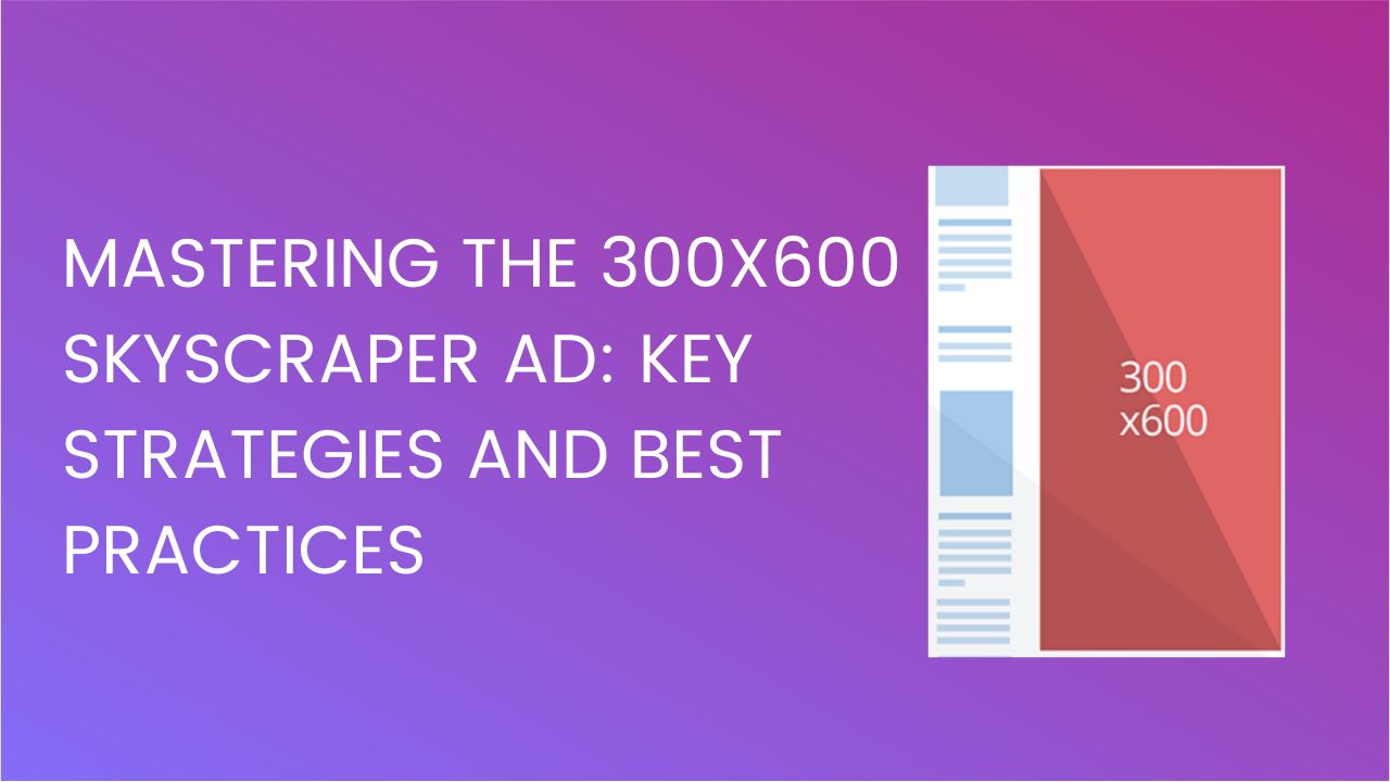
300×600 skyscraper, often recognized as the ‘Half Page’, has become the go-to ad format for publishers. This ad format, due to its significant dimension and distinctive vertical alignment, has established itself as an essential tool for advertisers to convey their messages persuasively. This guide will delve into the intricacies of the 300×600 large skyscraper ad, highlighting its benefits and offering best practices for optimal utilization.
The 300×600 Large Skyscraper Ad stands as one of the most lucrative ad formats in the digital advertising arsenal. Its impressive dimensions, 300 pixels in width and 600 pixels in height make it a prominent visual on web pages, offering a sizable canvas that is hard for site visitors to overlook. With its generous real estate, publishers have the flexibility to host rich media, engaging graphics, and detailed textual content, all of which are essential for captivating potential consumers.
For publishers, this ad format is synonymous with enhanced revenue opportunities. The 300×600’s prominent positioning, typically on the sidebars of web pages, ensures sustained visibility, leading to better ad recall and higher click-through rates. Moreover, its size allows for premium ad pricing, especially when combined with high-quality content and targeted advertising strategies. By integrating the Large Skyscraper Ad into their monetization strategy, you can effectively maximize their ad revenue potential while offering advertisers a valuable platform for brand messaging.
![300x600 Skyscraper Ad Optimization [Top Strategies] MonitizeMore 300x600 Skyscraper Ad Optimization [Top Strategies] MonitizeMore](https://www.monetizemore.com/wp-content/uploads/2022/04/ad-placement-implementation.png)
Given its substantial size, the 300×600 ad format dominates the webpage, ensuring that your ad captures the audience’s attention. This high visibility translates to better ad recall and, potentially, higher click-through rates.
The large skyscraper ad format provides ample room for rich media content. Advertisers can incorporate videos, animated graphics, and interactive elements to engage the audience better and deliver a more impactful message.
While originally designed for desktops, the 300×600 ad format adapts well to mobile devices. It seamlessly fits mobile screens when appropriately optimized, ensuring a consistent ad experience across devices.
The added space allows for more detailed storytelling. Advertisers can craft more compelling narratives, leading to higher user engagement and interaction.
To leverage this skyscraper’s full potential, it’s essential to understand the optimal placements on a site. Let’s talk about the best positions for the 300×600 ad format to maximize visibility and engagement.
While the above positions are recommended, it’s essential to keep in mind the following considerations:
While 300×600 skyscraper ads first gained popularity on desktop, it’s crucial to optimize them for mobile devices in today’s mobile-first world. Here’s how to ensure your skyscraper ads deliver a seamless experience on smaller screens:
1. Responsive Design is Key
2. Prioritize Speed and Performance
3. Test Thoroughly on Real Devices
4. Mobile-Specific Ad Networks
![300x600 Skyscraper Ad Optimization [Top Strategies] MonitizeMore 300x600 Skyscraper Ad Optimization [Top Strategies] MonitizeMore](https://www.monetizemore.com/wp-content/uploads/2023/05/Mobile_ad_format-Native.png)
While it’s tempting to fill the ad with as much information as possible, clarity should always be the priority. Ensure that the design is clean, with a clear focal point and a concise message.
Even though it’s a larger format, always optimize for mobile devices. Ensure that the text remains legible and that interactive elements work seamlessly on touchscreens.
As with all digital advertising formats, testing is crucial. Use A/B testing to determine which designs or messages resonate best with your target audience.
The larger size might lead to longer load times, especially if rich media is used. Always compress files and consider the user’s experience to prevent bounce rates due to slow-loading ads.
The 300×600 large skyscraper ad offers a unique blend of visibility, versatility, and engagement potential. By understanding its features and benefits, along with adhering to best practices, advertisers can harness its power to drive better outcomes for their digital advertising campaigns. Embracing this format, especially with the increasing shift towards mobile browsing, can pave the way for a successful advertising strategy. Ready to skyrocket your ad revenue? With MonetizeMore, a leading ad management partner, harness the power of expertly crafted skyscraper ads tailored to your audience. Dive into a partnership that’s proven to help publishers 10X their ad revenue.
Don’t miss out; elevate your monetization game with MonetizeMore today! Start Now!
![300x600 Skyscraper Ad Optimization [Top Strategies] MonitizeMore 300x600 Skyscraper Ad Optimization [Top Strategies] MonitizeMore](https://www.monetizemore.com/wp-content/uploads/2023/03/aleesha.jpeg)
With over ten years at the forefront of programmatic advertising, Aleesha Jacob is a renowned Ad-Tech expert, blending innovative strategies with cutting-edge technology. Her insights have reshaped programmatic advertising, leading to groundbreaking campaigns and 10X ROI increases for publishers and global brands. She believes in setting new standards in dynamic ad targeting and optimization.
10X your ad revenue with our award-winning solutions.